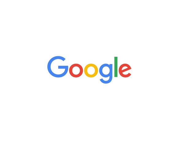
In light of the recent Google / Alphabet news, Google have released a new logo.
What do we think… we love it, but we feel that the loop in the second ‘g’ is too close to the line… but we’re just super fussy 🙂

Rumour has it that they got their inspiration for the new G symbol, from the O in our (mosaic) logo.

What do you think of the new Google logo? Submit your vote below!


