


For some strange reason, people who look at my desk, tend to think I’m an ‘Apple Fan Boy’… i know, they’re strange! 🤔
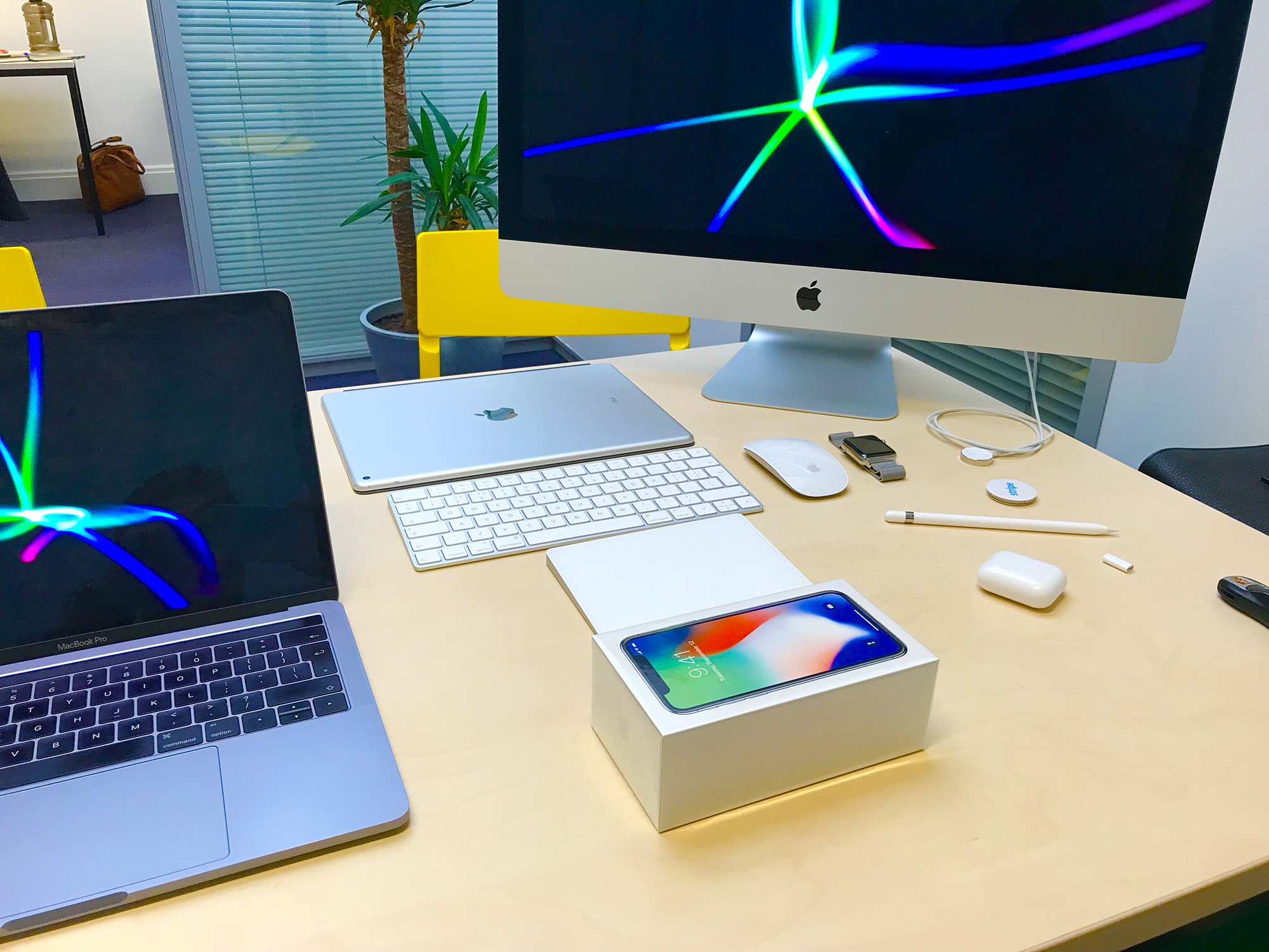
The Apple iPhone X was released in Ireland last week, and like most Apple products I frantically tried to get my hands on it first… not just to have the phone before Stephen (CEO of Jobbio.com), but because we need it to test our apps… obviously!
PS: technically… I won the race, as his phone is still sitting in it’s box, because he is far too busy staring at his new born son… CONGRATS 🎉
So, after 24hrs with the iPhone X… it’s time to say goodbye… 👋🏼
Without sounding like a total nerd or spoilt child… from a design point of view, Apple have sacrificed too much function, for aesthetics! Here’s how: 🤓
01 – The Top Inlet Bar
While Apple set out for an ‘edge to edge’ design, the black inlet at the top compromises their design, and destroys most apps… those that have even bothered to update in the first place. It is a complete eye sore. In the dark I feel like I’m holding a taser with two prongs. They should have continued with the steel bezel from around the sides and wrapped a steel lip in over the top… simple!
02 – Screen Size (the real screen size)
Apple boast that their new flagship phone is smaller than their previous flagship, the iPhone 7 Plus, yet it has a bigger screen… it doesn’t! A lot key players have already stated they won’t be updating their apps to be compatible with the iPhone X (predominantly Google… for obvious reasons). So, their app experience (UX) is somewhat similar to the small screen on the iPhone 5. This is very worrying, especially if you are trying play 8 Ball Pool… the table is now tiny 🎱
03 – Keyboard
As above, the screen is smaller and the phone is taller, therefore the keyboard is… ‘smaller’… too small for my fat fingers.
04 – Battery (how much do I have?)
You can’t see percentage wise how much battery you have. I’m one of those people who panic when their battery drops below 90% 😳
05 – Control Panel
You can’t access the control panel anymore by simply swiping up. You now need to hold the phone with two hands to swipe from the top (sorry, top right) to access your calculator, timer, etc… things I use every hour.
06 – Closing Apps
Hard closing apps feels like a process that was adopted from the first iPhone… which was a nice gesture from Apple to mark their 10 year anniversary 👀 Instead of just a simple swipe up on each app to close, you now have to swipe up, then over to the right, and then hard press to turn the apps into ‘close mode’… before you can finally start swiping up to close each app… far too many steps.
07 – Notifications
You can’t see your push notifications on your locked screen, unless you are looking directly at your phone as the Face ID needs to know that is you. WOW, that’s cool… no it’s not, it’s a pain in the Face! You now have to pick up your phone each time you receive a push notification, instead of a simple glance over at your phone to let you know a meeting is about to start.
I’m sure my ‘first world problems’ list will expand after today… my second day 🙄